The Childrens Drum Final Art
Richard Taninbaum, founder and creative director of Rhythm Tech contacted me about doing an artistic pattern for children’s drums. The problem was that the kids had no attraction to the look of the drums which had a murky pattern of dark blended colors of animals and other objects. My job was to come up with something that the kids would want to explore.
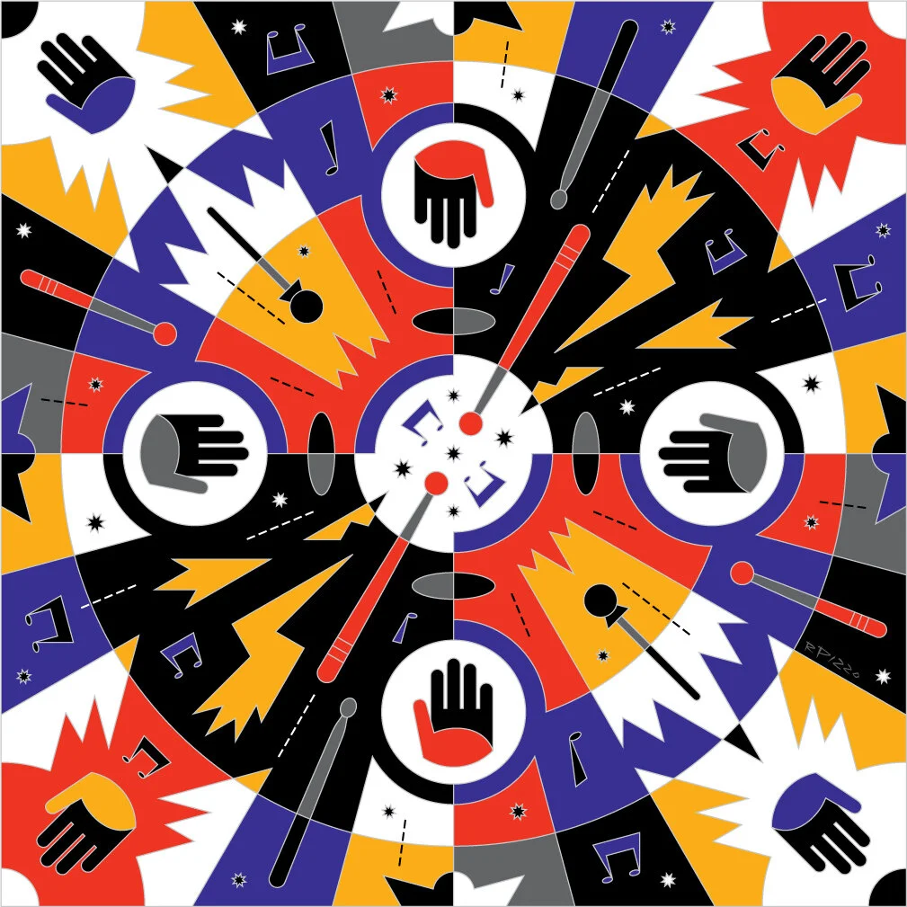
I started by thinking about the actual hands on aspect of the products, specifically bongos, snares, etc. and, to me, the essence was that contact point of your hand or a stick at the moment it contacted the head of the drum. I have nothing against animal images, in fact I’m the author/illustrator of an animal book but I felt the animals had nothing to do with the drums themselves so I wanted a different approach. I started thinking about “What does percussion look like?” The simplest way to start was drawing a flat circle to represent a drum head, and then drawing a stick or hand on top. Once I saw that, I realized that I wanted to show a burst of energy emanating from the contact point. Seeing that, I thought it would be cool to have many bursts, all exploding out from the center. Had this been a logo I would have kept it very simple, but here I was trying to capture the cacophony and energy of hands and sticks all smacking the drums. I was also conscious of the fact that it would be repeated as a pattern so I played up the kaleidoscopic aspect of it. I rendered the whole thing in bright, poster colors and the client was very pleased. The first thing they did with the prototypes was bring them to a classroom where the kids were previously uninterested. This time, they went right for the drums!

The final art duplicated to form a pattern for the drums.

The childrens drums on display in the Rhythm Tech booth at NAMM.